Browse a bundle as a website.
okf-render turns a bundle into a static site you open straight from the disk: a tree explorer, a Jump to palette, one page per concept with its trust and staleness at a glance, and a graph of how the concepts link. No server, no network, read-only.
What you get
okf-render <bundle> --out <dir>Point okf-render at a bundle and name, with --out, the directory to write the site into:
$ okf-render bundles/acme_retail --out ./acme-site
# then open ./acme-site/index.html in any browser — double-click it, no server needed
The output is a folder of plain files: an index.html at the root, one .html page per concept at the concept's own path (computations/gross-margin-period.html), a graph.html for the whole bundle, and an assets/ folder holding the scripts, the stylesheet and the fonts. Nothing is fetched from the network when a page opens, so the folder works from file://, from a USB stick, from a web server or from a documentation host alike. The pages below are all of bundles/acme_retail, the sample bundle in the repository.
okf-render is its own binary, separate from okf: the validator that runs in CI stays small, and only the site generator carries the vendored marked (MIT) that renders the markdown in the browser and the three embedded font families (SIL OFL 1.1). Both licences ship beside the binary and inside every generated site, under assets/licenses/.
Install it
a release archive per OS, or build from sourceEach GitHub Release carries an okf-render archive for Windows, Linux and macOS, on x64 and arm64. On Linux and macOS the install script fetches the right one and verifies its SHA-256: pass --bin okf-render to install the site generator instead of okf (the script is described in docs/cli.md). On any OS you can also build it from a checkout with dotnet publish src/OKF4net.Render -c Release, which needs the .NET SDK 10.0 or later and produces a self-contained Native AOT binary.
okf-render --help prints the usage, --version the build. The site is a snapshot: render again after the bundle changes.
A concept page, region by region
one header, three columns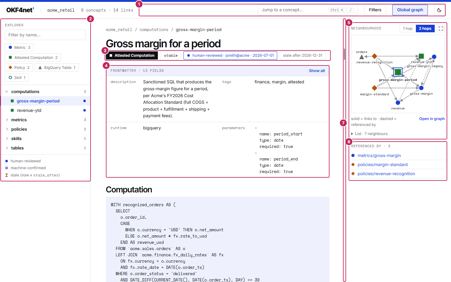
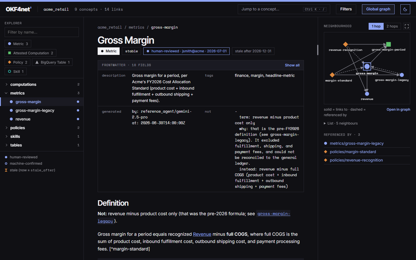
acme_retail, with the Neighbourhood graph set to two hops. The numbers are listed below.- The header, the same on every page: the bundle's name with its concept and link counts, the Jump to a concept… palette button, Filters, Global graph and the theme toggle. A Skip to content link comes before it for keyboard users.
- The explorer: the bundle as a tree, with type chips, a name filter and the legend of trust and staleness marks. More below.
- The chips under the title: the concept's type, its
status, its trust tier with who verified it and when, and its staleness. What they mean. - The frontmatter box, folded to four entries with a Show all button. The keys the title and the chips already show are not repeated in the folded view.
- Neighbourhood: the concept and the concepts it links to or that link to it, drawn as a small graph that a button enlarges. More below.
- Referenced by: the concepts whose body links to this one, with a count.
- The splitter between the centre column and the right-hand column: drag it to give that column more room. More below.
From 1,100 px of window width the three columns sit side by side; below that they stack, the page first, then its context, then the explorer, so nobody scrolls through a tree to reach the text.
Resizing the side column
drag it or use the keys — from 1,100 pxThe right-hand column — the context panel of a concept page, the detail drawer of the global graph — is 340 px wide by default. A thin bar on its left edge, the splitter, resizes it, so a graph can have more room. Drag it with a mouse, a finger or a pen: the column follows the pointer, and Esc during a drag puts the width back. The explorer and the facets column are not resizable.
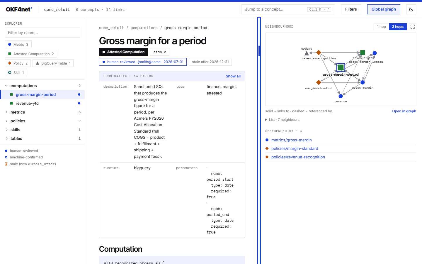
- Keyboard. The splitter is a tab stop (a
separatornamed Resize the side panel, with its width in pixels as its value). With it focused, ← widens the column and → narrows it by 16 px, 64 px with Shift; Home and End go to the narrowest and the widest; Enter or a double click restores the default width. Combinations with Alt, Ctrl or ⌘ are left to the browser. - Bounds. At least 240 px; at most the smallest of 60% of the window, 720 px, and what leaves the centre column 360 px.
- Remembered. The width is kept in the browser's local storage, under one key shared by the concept pages and the graph page; where the browser refuses storage, or does not share it between
file://pages, the splitter still works but forgets. - Narrow windows. Below 1,100 px the columns are stacked, the splitter is hidden and a stored width is ignored.
- The graph follows. When the drawing's area changes size, the global graph fits itself to it again, unless you have already moved the view yourself (then Fit does it).
The explorer
tree, type chips, filter, marksThe left column lists the bundle the way its directories do. A folder opens and closes on its own; a concept that is also a folder opens and expands separately. Rows are labelled with the last segment of the id, and the title is the tooltip.
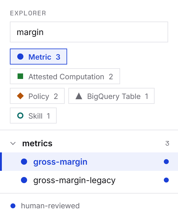
margin typed in the filter.- Type chips carry the type's name and its number of concepts. Pressing several chips shows any of those types; the name filter then narrows within them. Filters in the header moves the focus to the filter field and shows how many filters are active.
- Shapes and colours. Each type is drawn as a shape and a colour fixed by its rank: types are ranked by how many concepts carry them, most frequent first. The first five types get a shape of their own, every further type shares a sixth one. The same shape stands for the type in the explorer, the palette, the chips, the lists and both graphs.
- Trust and staleness marks sit at the right of each row: a filled dot for a human-reviewed concept, a ring for a machine-confirmed one, an hourglass for a concept past its
stale_after. A concept with noverifiedkey has no trust mark.
Jump to a concept
Ctrl+K or / — not full-text searchPress Ctrl+K or / on any page (or press the Jump to a concept… button) and type. The palette matches what you type against concept titles, ids and tags, lists the best matches with their type shape, title and id, and opens the one you choose. ↑/↓ move, Enter opens, Esc closes and returns focus to where it was.
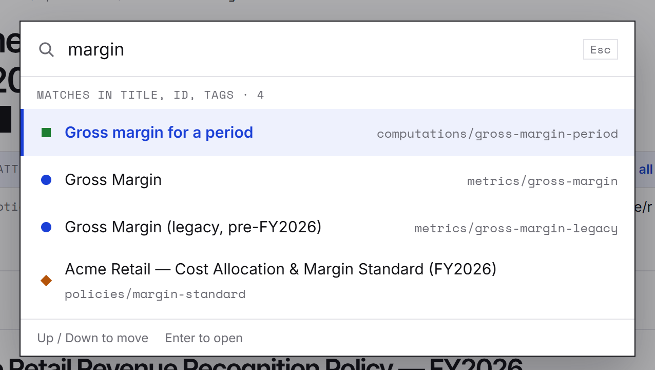
margin.The ranking is a fixed order of tiers over those three fields, not a weighted score, and it never reads the body of a concept: see What it does not do.
Reading a concept
body, contents, references, neighbourhoodThe centre column is the concept itself: a breadcrumb, the title (a leading # heading that only repeats it is dropped), the chips, the frontmatter box and the markdown body, rendered in the browser. Links between concepts work as links, and a link to a concept the bundle does not contain is flagged as broken. Headings get generated anchors, so an author's own #usage link lands.
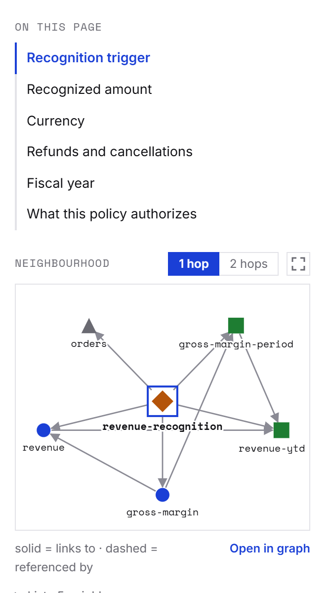
- On this page lists the concept's
##and###headings and marks the section you are reading as you scroll. A concept with no such heading has no list. - Referenced by lists the concepts that link to this one, with their number.
- Neighbourhood draws the concept and its neighbours, links out and links in, at 1 hop or, with the button, 2 hops, in rings around it. A solid line is a link to a concept, a dashed one is a link from it. At most 40 nodes are drawn, the concept included; the rest is announced as +N omitted. Links to concepts the bundle does not contain are drawn as ghosts and never navigate. Below the drawing, List gives every neighbour, drawn or not, with its relation to the concept: that list is the way to explore the neighbourhood without a pointer. Open in graph opens the global graph on this concept. A concept with no neighbour has no Neighbourhood.
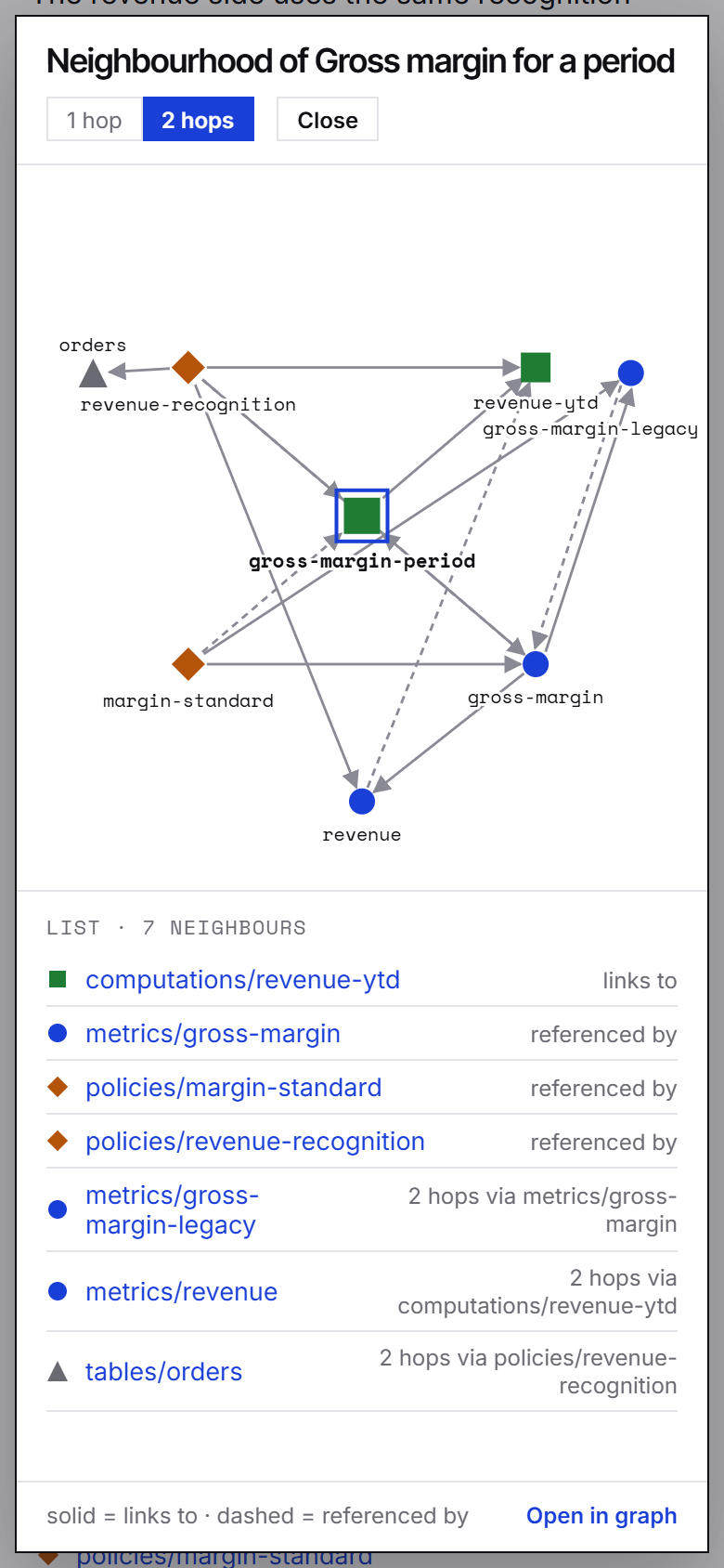
Enlarging it. The icon button beside the 1 hop / 2 hops toggle, Enlarge the neighbourhood, opens the same graph in a dialog, up to 1,100 × 760 px, for a neighbourhood too busy for the panel.
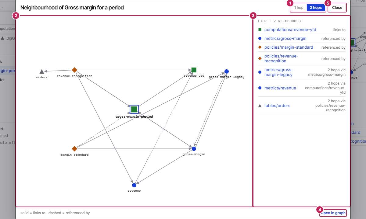
- The hop toggle, shared with the panel: change it in one place and the other follows. It is not remembered from one page to the next.
- The drawing, laid out for the room it has: shapes and text keep their size, the rings spread out and, once the drawing is 560 px wide, labels are cut at 32 characters instead of 20. The cap of 40 nodes still applies, with the same +N omitted note. A click on a node opens its concept; a ghost does nothing.
- The list, always open: every neighbour with its relation to the concept, as in the panel.
- Open in graph, the same link as in the panel.
- Close. Esc, the button, or a click on the dimmed page behind also close it and put the focus back on the button that opened it.
While the dialog is open, Tab and Shift+Tab move among its own controls and wrap round, the page behind is inert and does not scroll, and / and Ctrl+K do nothing. Below 760 px of window width the dialog fills the window and the list goes under the drawing.
The global graph
graph.html — §6 links, laid out in the browserGlobal graph in the header opens graph.html (graph-1.html if a concept already uses the name), a page that draws every body link of the bundle — the edges okf graph counts — with the arrows pointing at the target. The layout is computed in your browser, and it is deterministic: the same bundle gives the same starting layout on every conforming browser.
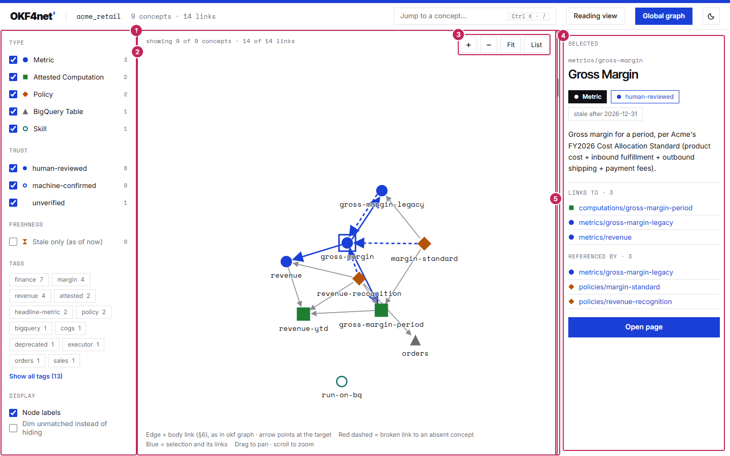
metrics/gross-margin selected. The numbers are listed below.- Facets, which narrow what is drawn. A node must satisfy every facet that has something chosen (and between facets) and any one of the values chosen inside a facet (or).
- The drawing. The wheel zooms and the background pans; a node can be dragged. The selection and its links are drawn in blue and a broken link to an absent concept is dashed.
- The tools: zoom in, zoom out, Fit, which frames everything drawn, and List.
- The detail drawer of the selected concept: its id, title, chips, description, the concepts it links to and those that reference it, and an Open page button. In the header, Reading view leads to the selected concept's page.
- The splitter, which resizes the drawer: see Resizing the side column.
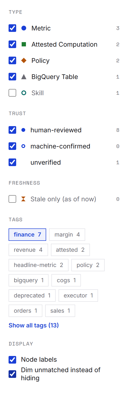
finance chosen and unmatched concepts dimmed instead of hidden.- Type and Trust have a checkbox per value with its count; Freshness offers Stale only (as of now); Tags shows the twelve most frequent ones, the rest behind Show all tags (N).
- Display switches the node labels and chooses between hiding unmatched concepts and dimming them.
Large bundles. Above 1,500 visible nodes (concepts and absent targets) the graph is not drawn at all: the list is shown and the status line asks for narrower filters. The list is also there whenever you want it, with the same facets applied.
Addresses. Selecting a concept writes graph.html#<concept id> to the address bar without adding a history entry, and opening such an address selects that concept. A concept page's Global graph link carries its own id, so it lands on that concept.
Keyboard. The drawing is a single tab stop. Inside it, Page Up and Page Down move through the nodes in index order, Home and End go to the first and the last, an arrow key goes to the nearest neighbour in that direction, Space selects and Enter opens the concept's page.
Theme and small screens
follows the system, works on a phoneThe pages follow your system's light or dark setting. The moon button in the header overrides it for that site and remembers the choice in the browser's local storage; where storage is unavailable (some browsers refuse it for file:// pages) the page simply keeps following the system.
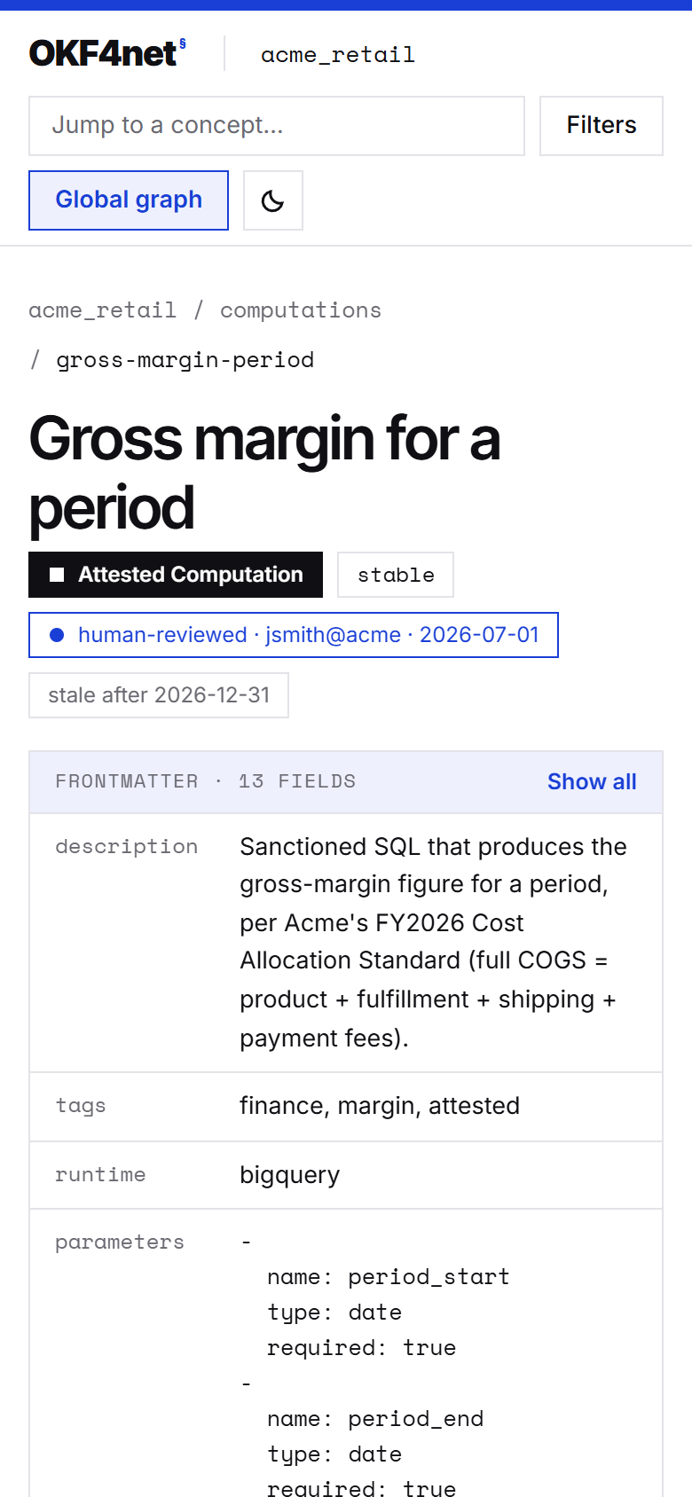
On a narrow window the header wraps onto several rows and the columns stack as described above.
What the marks mean
§5.2–§5.5 — advisory, never access controlEvery mark comes from the concept's own frontmatter; okf-render reads it through the same audit that okf audit runs.
| Mark | Means (and where the spec says so) |
|---|---|
| human-reviewed | verified holds at least one entry whose actor is human:<id> (§5.2, §5.3) |
| machine-confirmed | verified holds entries, but only from actors that are not human: (§5.2, §5.3) |
| unverified | No verified key, so no trust mark is drawn (§5.3) |
| stale after D / stale since D | stale_after is a date still to come, or already reached (now ≥ stale_after); the hourglass marks the second (§5.5) |
| status chip | draft, stable or deprecated, as the concept declares it (§5.4) |
The trust tier shows who a concept says reviewed it and when, not a proof that they did: the spec calls these tiers advisory signals, not access control, and okf verify cannot authenticate the actor it is given. Staleness is judged as of reading: the page compares stale_after with your browser's clock when it opens, and again when the tab becomes visible again, so a page rendered in March can be stale in June without being rendered again.
Keyboard and assistive technology
every view has a text equivalent- Everything is reachable without a pointer. The explorer, the palette, the frontmatter toggle, the graph's facets and tools are ordinary buttons, links and checkboxes in a sensible tab order; focus stays inside the palette while it is open and returns to where it was on Esc.
- Names and states are announced. The palette is a modal dialog with a labelled list and its active option; type and tag chips and the theme toggle report whether they are pressed; the selected node of the graph carries
aria-current. - Drawings are never the only view. The Neighbourhood has its List; the global graph has its List, the detail drawer and the keyboard contract above; the marks differ in shape as well as in colour.
- Motion is optional. With the system set to reduced motion the graph's layout still runs, without the animation.
What it does not do
by design- No full-text search. A static site has no process to run the shared
ConceptSearchscorer in, and copying its weights into JavaScript would fork it. The palette finds concepts by title, id and tag; to search bodies, useokf-mcpor the library (mcp.md, library.md). - No server and no live reload. There is no
okf serve, and none is planned. Render again to see a change. - Read-only. The pages never write to the bundle, and the bundle's markdown is untrusted input: raw HTML in a concept body is sanitised in the browser, scripts and event handlers included.
- Staleness is as of reading, not as of rendering, and trust marks are declarations (see above).
→ cli.md — the okf commands that check the same bundle · getting-started.md — write one first